.406 Ventures
Year
2025
Role
Logo design, brand design, UI design
Designed at Image Conscious Studios. Creative Direction by Adam Gesuero, UI designed in collaboration with Thandiwe Tembo, development by Logan Wisniewski and Greg Johnson. Photography by David Shopper.
406ventures.comSituation
With a 20-year history of investing in technology and healthcare, .406 Ventures is a VC firm brimming with humanity and expertise. Over the years, the brand identity had become disjointed, and needed a wholesale refresh to stand out in a competitive space. The .406 team wanted to see a totally new look for their company, without losing any of the brand's personality in the process.
Process
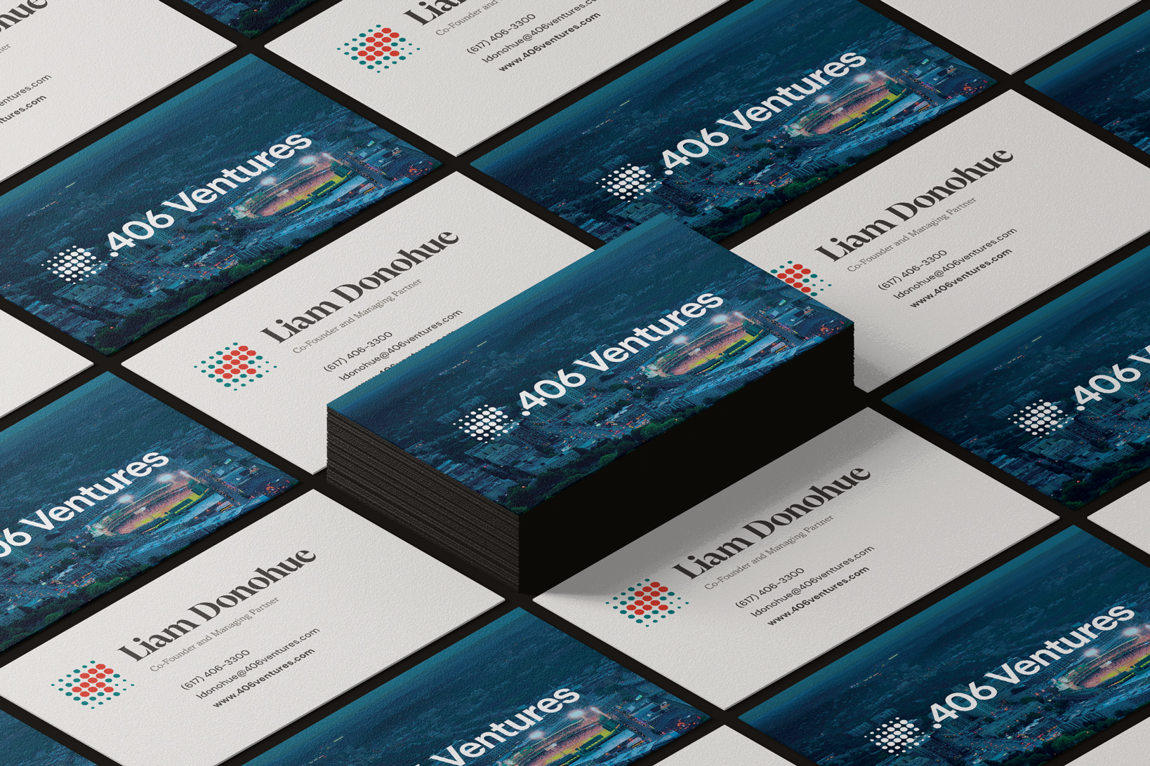
Before any design work began, we started with an audit of .406's existing brand materials. I tracked down all the mismatched variations of color, type, logos, and more, from every asset in the .406 library. I then presented a pared down, unified version of the existing identity, as an intermediate step towards refreshing the brand. Collateral including business cards, social media templates, slide templates, and email signatures were updated in order to align with this version of .406 Ventures.
The true refresh began with the logomark. A logo that worked at every scale, and on any background, was sorely needed. This was the first area where I was able to start modernizing the brand.
Then it was time to look to the firm's web presence, where a top-to-bottom restructuring and redesign began. I used the website as the foundation for building out the new look and feel for the brand. .406 Ventures has always made a point to emphasize their roots in Boston (the company name is a reference to iconic Red Sox left-fielder Ted Williams), so I designed an identity that nodded to its history with pride, but didn't confuse the audience with baseball-themed imagery. The new brand showcases the warmth and personality, forward-thinking strategy, and industry expertise that makes .406 Ventures unlike any other.

"77 baseballs" by Ewen Roberts, CC BY 2.0, via Flickr.
Designing the logo
The .406 Ventures logomark was based the strike zone diagram from The Science of Hitting by Ted Williams. To create a better version of the mark, I looked back at that original reference, focusing on the "happy zone" area of the diagram–where Ted Williams was able to achieve his highest batting average (an average of, you guessed it, .406). I explored different ways of simplifying the happy zone motif to reduce the size and number of colors.
In the end, I brought the mark down to a square 6x6 grid. This preserved the unique shape of the happy zone, while creating a less busy mark that's easier to scale down to smaller sizes. The new square dimensions gave the mark more balance when placed next to the text of the logo, where before it was much taller and dominated the text. I also used size along with color to mark the different areas of the strike zone, so the logo communicates meaning even in solid black, or to a user with color blindness. This makes it more versatile, no longer requiring 4 different colors to properly display the mark.


Brand System
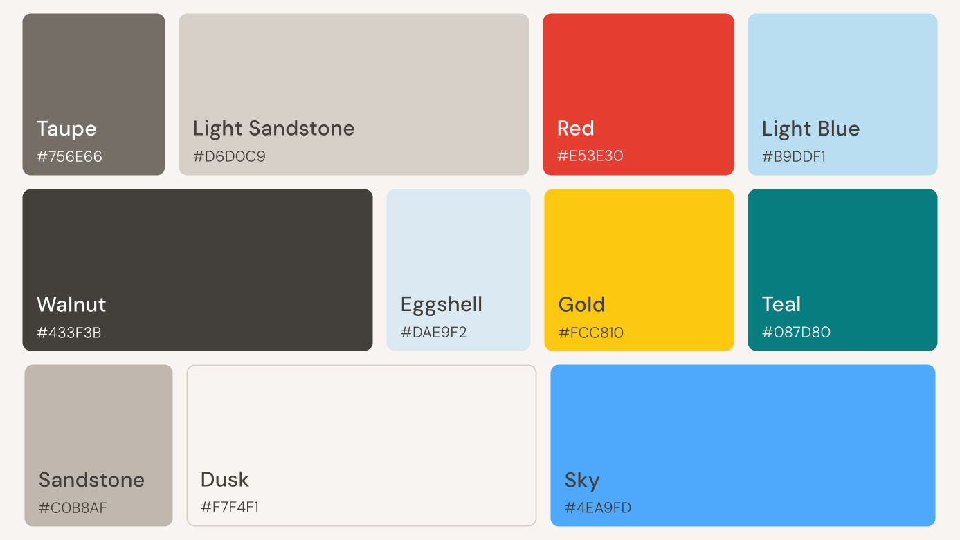
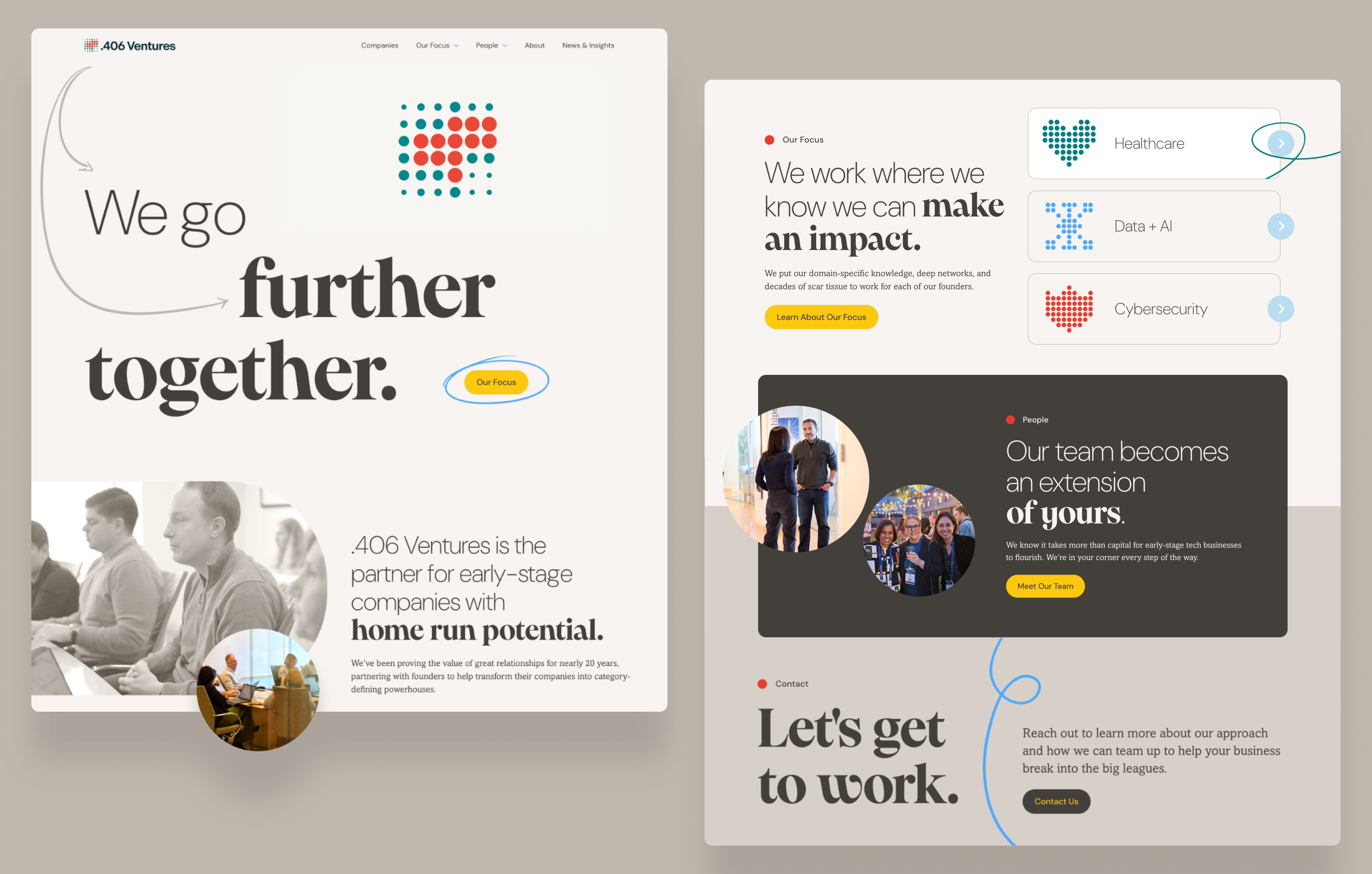
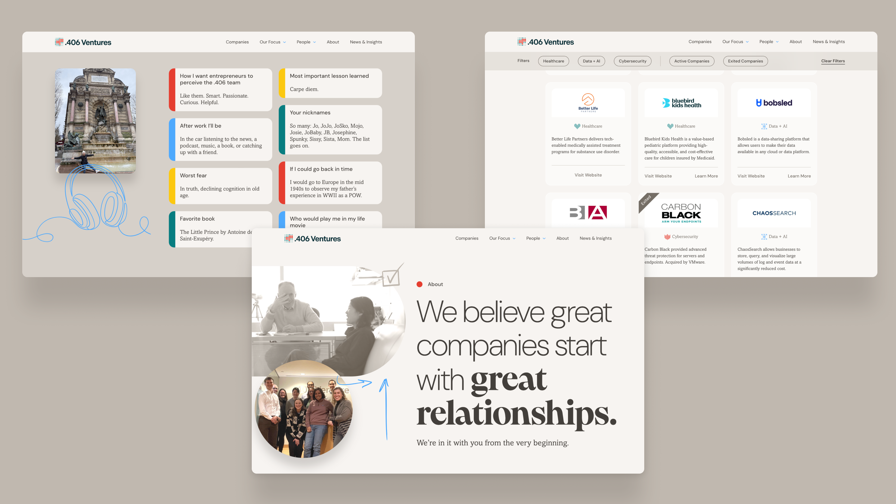
Using a color palette of .406's familiar teal and red paired with warmer neutrals and brighter accents, and a daring combination of contrasting typefaces, I went piece-by-piece through the system of brand assets. A new identity emerged, with candid videos of .406 team members annotated by hand-drawn pen scribbles, ensuring that a human touch shone throughout the system.

Website
The .406 site was completely re-imagined to bring greater focus to their portfolio companies. Along with designing the user interface, I created an animated version of the new logomark, designed a set of icons to highlight the company's three investment sectors, and provided comprehensive directions for a professional photoshoot of the team.